Function plotting and the inverse cdf
I previously wrote about using the inverse-cdf transform not just for its classic application of efficient random sampling, but as an optimal histogramming-binning generator mapping exactly to expected population quantiles.
(If you think of the random process that populates the histogram as itself being done via uniform random sampling of the unit cdf interval, mapped back into the coordinate value using inverse-cdf, it's even clearer why a uniform binning of the cdf interval would be optimal.)
In this post I'd like to show that we can usefully bend the inverse cdf at least a little further, into applications where there isn't even traditionally a positive-definite pdf. My motivation is efficient function plotting.
In the YODA new plotting system, I'd like us to be able to overlay analytic -- or at least Pythony -- functional forms on top of data- or MC-populated histograms. But just creating a linspace() of lots of points in $x$, and hoping that'll be enough to smoothly render the most rapidly varying bits of a plot -- the usual approach -- is unsatisfying.
If that plot has a mixture of curvy bits and straight sections, we could distribute a given number of points more efficiently, as straight parts need only one point at either end to draw a (Postscript or PDF) line between, and the points budget would be better spent in the curvy parts where straight lines are nowhere a good approximation. If we're stuck with using straight-line segments -- which we more or less are with matplotlib -- then distributing their endpoints more efficiently means we can get a good visual effect everywhere on the plot with fewer points, and hence a smaller file-size.
Let's think a little: as intimated above, the key issue is not the gradient $df/dx$ of the function $f(x)$, as I can draw a steep-gradient straight line just as effectively with two points as I can a flat one, but the second derivative $d^2f/dx^2$, aka the "curvature". So let's make a guess that what our brains want to see proportionally mapped out is point density in proportion to the curvature. So we can use the inverse-cdf method again, right: the cdf is $$F(x) = \int \frac{d^2 f}{dx^2} dx = \frac{df}{dx} ,$$ right?
Ah, but curvature can be both positive and negative: that messes things up. We really need $$F(x) = \int \left| \frac{d^2 f}{dx^2} \right| dx ,$$ but that's a more awkward object: we'd need to decompose into the set of positive-curvature and negative curvature intervals, and add up the integrals from each, e.g. $$F(x) = \sum_i \pm \int_{\omega_i} \frac{df}{dx} \Big|_i ,$$ with appropriately identified $\pm$ signs.
We could maybe do this for arbitrary functions with a symbolic algebra library like sympy but it's awkward. And doesn't solve the elephant-in-the-room issue that most monotonic functions, and hence most cdfs, don't have an analytic inverse. (This problem is also the major limit of the inverse-cdf method in general, of course.)
When in doubt, sample to victory! Let's just throw lots of evenly spaced points at our function, numerically compute an array of second derivatives and take their absolute values, then compute a numerical cdf by taking the cumulative sum of the array:
|
xs = np.linspace(XMIN, XMAX, 1000)
|
|
ys = f(xs)
|
|
ypps = np.diff(ys, 2)
|
|
ayps = np.cumsum(abs(ypps))
|
|
ayps /= ayps[-1]
|
where the final line normalises to make sure the cdf really adds up to 1 as intended. Then we can throw a more modest number of points linearly into the cdf interval, and numerically invert via straight-line interpolations:
|
def G(q):
|
|
return np.interp(q, ayps, xs[1:-1])
|
|
qs = np.linspace(0, 1, N)
|
|
xs_opt = G(qs)
|
|
ys_opt = f(xs_opt)
|
Let's see the result on a pretty nasty function, $$f(x) = (2.5 - x) + e^{-2x} \cos(20 x^{0.7}) ,$$ using just 50 points:
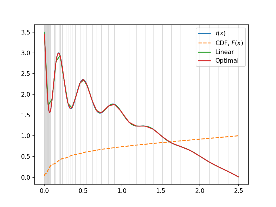
Not bad, huh? The red line is this optimal sampling approach, the green (with visibly bad-approximation straight lines in the wibbly left-hand part) is the uniform straight-line approximation, and the true function is hidden underneath in blue. The grey lines in the background show the "optimal" sampling points, uniform in the $y$-axis of the cdf, overlaid in orange.
Now, I've cheated a little here, because to my eyes that assumption that the (magnitude of the) second derivative is proportional to the optimal sampling density isn't quite correct. Unsurprisingly, our visual cortexes are a bit better than that; in particular we seem to be fairly good at compensating for scale differences, so we see deviations from low-amplitude bits of smooth curve not so differently from on high-amplitude versions of the same shape. In the full code, reproduced below, I added a micture fraction $f$, so you can fade smoothly between purely "optimal polling" and "uniform polling" strategies. There are probably smarter ways.
I hope this was interesting. It feels to me like there's more potential to play and improve here, but hopefully we'll deploy this feature into YODA's plotting before too long!
#! /usr/bin/env python

import numpy as np
import matplotlib.pyplot as plt

N = 50
XMIN, XMAX = 0.0, 2.5
F = 0.6

def f(x):
    "Function to plot"
    #return np.exp(-x) * np.cos(10*x)
    return (2.5 - x) + np.exp(-2*x) * np.cos(20*x**0.7)

## Naive version
xs_lin = np.linspace(XMIN, XMAX, N)
ys_lin = f(xs_lin)

## Densely sample to build an cdf of |f''|
xs = np.linspace(XMIN, XMAX, 1000)
ys = f(xs)
ypps = np.diff(ys, 2)
#ypps /= (ys[1:-1] + np.mean(ys))
ayps = np.cumsum(abs(ypps))
ayps /= ayps[-1]

## Mix with linear in F:1-F ratio
byps = np.cumsum([1. for x in xs[1:-1]])
byps /= byps[-1]
ayps = F*ayps + (1-F)*byps

## Invert cdf
# TODO: make more efficient!
def G(q):
    return np.interp(q, ayps, xs[1:-1])
qs = np.linspace(0, 1, N)
xs_opt = G(qs)
ys_opt = f(xs_opt)

## Plot
for x in xs_opt:
    plt.axvline(x, color="lightgray", linewidth=0.8)
plt.plot(xs, ys, label="$f(x)$")
plt.plot(xs[1:-1], ayps, "--", label="CDF, $F(x)$")
#plt.plot(xs[1:-1], ayps, "*")
plt.plot(xs_lin, ys_lin, label="Linear")
plt.plot(xs_opt, ys_opt, label="Optimal")
plt.legend()
for f in [".png", ".pdf"]:
    plt.savefig("curvplot2"+f, dpi=150)
#plt.show()
Comments
Comments powered by Disqus